Most of the homes below are within a mile of our 2-flat.

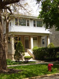
What did it look like originally? I see a single family dwelling buried beneath the swiss chalet motif, aluminum siding, and stucco porch. Looks like generations of muddlers have lived here.
Here's another aluminum siding addition added onto a grey stone 2-flat.
The beauty of the building is buried.

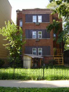
The building below has had some kind of scaffolding on it for a few years. And it has a year round nativity scene with a Santa in it in front of the building.
Brown siding or picture windows or open porch/decks? You decide.

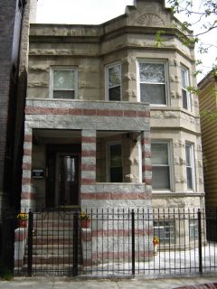
I just don't understand multi-colored cinder block combined with a beautiful greystone. And to top it off, they cemented what little yard they have-maintenance free I suppose. This one in particular stymies my imagination. I just can't believe that anyone would think it looks good. To top it off, I believe they built the new porch level, but the 2-flat isn't!

Next installment: "The Ugly": beautiful homes in a state of deterioration and disrepair.
Disclaimer: These are only my opinions. I respect that others have different tastes and need to be saved from their own bad remodeling choices.

6 comments:
OMG! That is WILD! What an eye you have. I"m very impressed. I wouldn't notice a building if it fell on me. lol
The level porch on an unlevel building is really bad. You can bet they paid a lot of money for that two-tone porch. As for the manger scene, there are many homes here that sport long-deflated giant snowmen and hanging icecicle lights year-round and after a while they begin to sag and eventually break down until hanging in shreds. Lovely.
My closing is scheduled for 6/15 so I hope to do my own little study for Jackson. It should be fun and I think it's a great idea you have posting the pics. I can't wait to see more.
The greystone with the cinderblock porch is heartbreaking. If I bought that beautiful home I would have my sledgehammer out the first weekend.
Someone once said that pressure treated wood is the "underwear" of the construction industry. It should almost never be seen. I think cinderblocks fall in that category too.
A big AMEN to Grex's cinderblock comment- I agree totally. Cinderblock exteriors belong on the back of shopping malls.
Todd- you made me look up pastiche!
Ha ha, I looked up pastiche, too. I think I need another word of the day calendar.
Update: Since this post, the first building pictured has been leveled for a 6 unit condo building. It's all about the density!
Post a Comment