
Along with updating the upstairs, which will involve pretty much a gut rehab that we will hire out, we are planning to have some work done on our building including the following: tuckpointing, new back porch, back yard fence and some other small things. The goal is to get our building to a point where we can focus a bit more on other interests and that is why we are planning to bite the bullet and get this work done.
 Anyway, for interest, I thought I'd show you the only 2-flat converted to a 3-flat that we have found so far. Well, of course there are the nasty frame additions on stone buildings but those don't count because we would never do that.
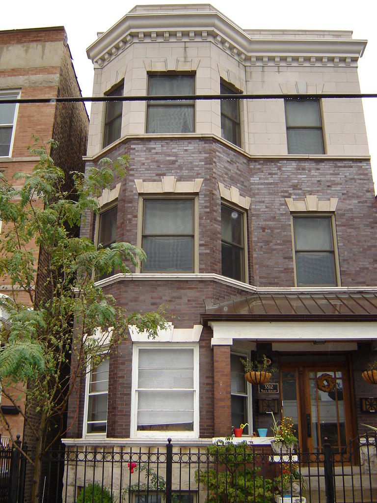
This one was handled by a Chicago architect that we contacted, but never met with. There are details and photos of the project on this website under Projects-Chicago-Ashland. They did this one way better than many others, but I still don't like it. The "stone" on top tries to match the accents on the building, although the 1st floor stone accents are painted white, but it just doesn't quite look believable.
What would your rating on this 3rd story addition be on a scale of 1-10 with 10 being the best and 1 being the worst?
I think if they got the paint off those accents and had matching windows on the entire building as well as changing the color on the porch, it could look better, but we wouldn't want our building to look this way. They did splurge on common brick sides to the building so it matches very well.
My new rule: one floor at a time.
Here's what that building looked like originally :

7 comments:
Yes, it is not stucco or vinyl, that is a big plus. Still, it looks out of place with the first 2 floors. To me an addition should look like it was an original part of the house. This addition does not look that way to me. By itself, the third floor gets an 8. By itself, the first 2 floors get an 8. Together, I give them about a 6 at best. If they had done brick on the whole thing it would have been better. My only guess is that they could not get brick to match the first two floors so instead of having unmatched brick they went with the stone. I’ll give them an “E” for effort. However, I think this is one of those instances where leaving well enough alone would have been better. I’m in a real anti “bigger-is-better” mode right now, so that plays a part in my assessment.
I'd give it a 7.5, but the painted stone accents have got to go. To me, it looks very much like it belongs there. By far the best 2 flat to 3 flat conversion I've ever seen.
-Brian
I'd give it a 6 1/2. I can't believe they couldn't do a better job of matching the brick or stone below. Especially with as many of these meeting their fate and being destroyed. Overall it looks good and solid but the 3rd floor looks like it doesn't belong because of the material they used and that takes away 3 1/2 points all by itself in my opinion. I'm sure it cost an arm and a leg to add it so they could have paid another arm and leg and located some matching stone/brick. I'm being a grump. Sorry.
It is possible to get matching brick and have it "aged a bit". The same brick is still available and they went to all the trouble to use common on the sides.
I blame the architect a bit for letting them do it this way- he should have known better.
It is way better than many shoddily done additions but I am with Greg on the aesthetic issue.
Before I read that this was a conversion, I thought, "Hmmm, that house looks mismatched."
I think the work they did on the porch improved the look of the house. Matching paint would definitely help.
The height actually works because before the building looked a little dwarfed by the taller one next to it.
Overall, I give the addition an 8.
I would give it a 6.5 to 7. They obviously (as everyone else has pointed out) tried very, very hard to get everything to work together, but failed. We don't have this style of architecture around here, so I don't have much of a frame of reference, but I think that they could have done a better job.
Well, if it's any indication of the rating I'd give it, I thought the photo was Photoshopped just as an example of a 2-into-3-flat. :O
I'd give it a 6. It's *almost* right. But not.
Post a Comment