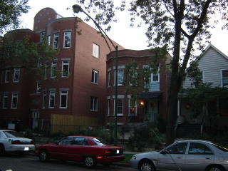
 Everyone likes a good before and after shot. Some may remember the house next door that was torn down over a year ago (I can't believe I did nothing to try and stop it- I really could have).
I promised to post photos of the completed project and it's just been landscaped. They had loads of problems, fired the original contractor, had to rip out poorly installed trimwork etc...
Anyway, here's what is there now. The one blessing is it's brick sided so we don't have to look out at concrete, but I think it's a little funny looking- what do you think?
It's not terrible, but the proportions just don't seem quite on the mark. Steve, being a graphic designer, said the sign was poorly done. The spacing on the lettering is off, which is a shame.
Here's the street view now.


7 comments:
ummmm... yeah. You should have tried to stop that.
One thing anonymous- it's not uncommon to see large multi-unit buildings beside 2-flats or single family homes in the city of Chicago. I guess to a fresh eye it looks really out of proportion.
It’s not entirely offensive looking but it is monstrous! When compared to your charming home and your other neighbor the new building looks completely out of place. Was the home that was torn down on an oversized lot or did they bulldoze more than one home. Its huge! Does it cast a shadow on your property?
Jocelyn,
Is the pic of the house on top the one that was torn down? If it was that is a shame. I don't think the new mega-plex is all that bad looking but it certainly dwarfs your home and looks out of place. Unfortunately progress takes its toll and as the demand for housing rises (especially in desirable areas) this type thing will continue.
I'll also ask what Greg is asking: Has it interfered with the amount of light you were getting before? How is the view from your windows now as opposed to the view before?
we actually get a bit more light as the new building is farther from our house. We face east. Upstairs I am not sure the impact.
Hopefully the new people that move in will care about the neighborhood and be good neighbors too :)
Not a HORRIBLE building, but not great either. That tombstone on top is just insanely out of proportion and their silly attempt to decorate it is laughable, but in the materials and rounded bays they really seem to have tried to respect the neighborhood. I actually think it's a benefit to mix rentals, condos, and single family homes of various sizes. You get more diversity, and a liveable density that makes neighborhoods more walkable. I just wish more modern buildings were of high enough quality that they didn't look embarrassed to stand next to their elders.
I agree that it's not awful, but it doesn't look quite right either. To me, it looks a bit squished and stretched upwards. It could be worse though...
Post a Comment